Overview
elide offers tools to manipulate Spatial* objects of all types to compare unfamiliar spatial extents to more familiar benchmarks. This tutorial shows how to use this function to make compelling visual comparisons.
Featured skills:
elideto move, rotate, and scale Spatial* objects- aggregating polygons
- calculating new polygons from overlapping polygons
- calculating global and regional centroids
- plotting spatial data with
ggplot2
UPDATE (September 2017): The sf package has been developed to allow better integration of spatial data with the tidyverse. By re-imagining the way that spatial data are stored, many of these clunky steps to get shapefiles into ggplot can now be avoided. However, not all sp* functions are available yet as of this writing. For more, see the sf package vignettes at
https://r-spatial.github.io/sf/.
A loss in translation
Ecologists (and field scientists more generally) work over vastly different scales, and we rely on familiar units like sports field sizes, famous building heights, and administrative boundaries to communicate these scales in a meaningful way.
But what happens when your audience doesn’t have a connection to these cultural touchstones? I moved to Switzerland from the western United States earlier this year; the subdivisions of national subdivisions I’m used to are the size of national subdivisions and even whole sovereign countries. Despite the relief of being able to use the metric system in daily interactions, most of my go-to “visceral units” are just as useless to my colleagues and my audiences here as the abstract large numbers they try to make tangible.
Here I show how to overlay countries and other administrative boundaries from all over the world using R, revealing their relative sizes in a visual, visceral way. This tutorial was inspired by Dr. Rosie Woodroffe, who very effectively deployed a similar visual strategy to communicate the enormous size of African Wild Dog home ranges in her recent seminar at the University of Zürich. There are several interactive tools available like The True Size Of…, but none of them have the flexibility to handle custom spatial data. A handful of simple tools in R fill this gap.
Data
Numerical precision is an essential tool of science, but it tends to lose audiences whether composed of scientists or non-scientists. For a visual representation of scale, we need spatial data.
We’ll consider two examples:
Plotting my Ph.D. field sites against a Swiss-relevant benchmark.
Tiling California with Switzerlands to show off a few other features.
The administrative boundary data come from the Global Administrative Area database. I’ve also pulled in some open data archived with Dryad from my dissertation work.
Code
1. Communicate spatial scale in X to an audience in Y
1.1. Preliminaries
Load the packages containing the functions we’ll use. If you haven’t used these packages before, be sure to install.packages first.
library(raster)       # despite the name, we'll use it to access vector
                      # representations of administrative boundaries
library(rgeos)        # spatial tools
library(maptools)     # more spatial tools
library(tidyverse)    # data wrangling workhorse
library(ggplot2)      # plotting workhorse
library(ggmap)        # contains a useful theme_nothing for very simple maps
Package versions used:
##     Package    Version
## 1     ggmap      2.6.1
## 2   ggplot2      2.2.1
## 3  maptools      0.9-2
## 4    raster      2.5-8
## 5     rgeos     0.3-23
## 6 tidyverse      1.1.1
1.2. Retrieve spatial data
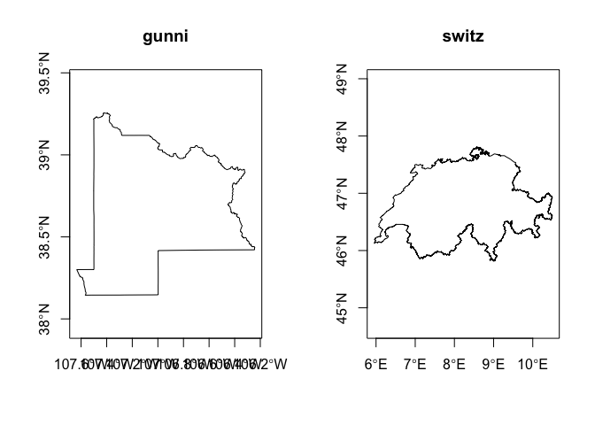
We’ll start by gathering the appropriate data and subsetting it where necessary. getData will only download full countries where the level argument specifies whether the boundaris are for the full country outline (level = 0), first subdivisions (level = 1 like states, provinces, or cantons), or second subdivisions (level = 2 like US counties; only available for some countries). Note that a full list of ISO-3 country codes may be called using getData("ISO3"). For more detail, check out the metadata at GADM.
## Gunnison County, Colorado, USA
# download US county boundaries
USA.2 <- getData("GADM", country = "USA", level = 2)
# subset to focal county
gunni <- USA.2 %>%
  subset(., USA.2$NAME_2 == "Gunnison")

## Switzerland
# download Switzerland country boundary, no subsetting necessary
switz <- getData("GADM", country = "CHE", level = 0)
A quick plot just to make sure we specified the correct level illustrates the problem: we can’t just plot each polygon and expect them to line up. R automatically scales each polygon to fill the plot canvas, so the latitudinal range of gunni is about 1.5° whereas the latitudinal range of switz is closer to 5°. Moreover, they each occupy a different part of the coordinate range.
1.3. Move mountains (and lakes, rivers, cities…)
The first step is to determine how far west and how far south we need to move Switzerland such that it aligns properly. One solution is to guess and check, but we don’t have all day. Instead we can calculate the centroids of both polygons, then calculate the rise (=latitude) and run (=longitude) of an imaginary right triangle whose hypotenuse is the direct path from centroid to centroid.
# centroid of Gunnison County
gunni.center <- gCentroid(gunni)
# centroid of Switzerland
switz.center <- gCentroid(switz)
# calculate latitudinal and longitudinal displacement of Switzerland using the centroid
# of Gunnison County as a reference point
shift <- coordinates(gunni.center)-coordinates(switz.center)
Now we can use elide to move the whole country of Switzerland (with free shipping!). R doesn’t know that we’ve accomplished such a herculean task. The polygon of Switzerland is just a polygon with no deeper meaning or expectation of where it should be relative to other places on our map. To avoid confusion (and preserve the correct position of Switzerland), we’ll store the shifted Switzerland in a new object.
switz.shifted <- elide(switz, shift = shift)
1.4. Make the map
And now for the big reveal, had I not so effectively spoiled it with the image at the top of the post. We’ll convert the polygons into ggplot2-friendly data frames, then build up our map layer by layer.
# "fortify" polygons into plottable data frames
gunni.fort <- fortify(gunni)
switz.shifted.fort <- fortify(switz.shifted)

# make map
overlay<-ggplot(data = gunni.fort, aes(y = lat, x = long, group = group, fill = NULL)) +
  geom_polygon(fill = "transparent", color = "blue", size = 0.5) +  # plots Gunnison County
  geom_polygon(data = switz.shifted.fort, aes(y = lat, x = long, group = group, fill = NULL),
               fill = "transparent", color = "black", size = 0.5) +  # plots Switzerland
  coord_equal() +
  theme_nothing()

## Warning: `panel.margin` is deprecated. Please use `panel.spacing` property
## instead

overlay
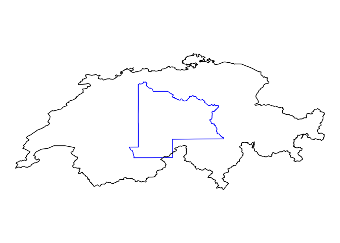
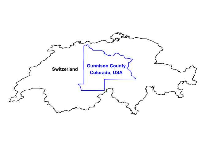
Our approximation based on the centroids of each polygon got us very close, but there’s a visually sloppy overlap along the southern borders. Ideally, we’d like Gunnison County (in blue) to fit nicely wihin the bounds of Switzerland (in black). From here the adjustment is manual: the east/west alignment of the centroids looks pretty good, but we need Switzerland to overshoot a little more to the south.
# leave longitude shift alone, adjust latitude shift a little more south
shift2 <- coordinates(gunni.center)-coordinates(switz.center)-c(0,0.12) # units are in degrees!
switz.shifted2 <- elide(switz, shift = shift2)
switz.shifted.fort2 <- fortify(switz.shifted2)

# update map and add some helpful labels
overlay2<-ggplot(data = gunni.fort, aes(y = lat, x = long, group = group, fill = NULL)) +
  geom_polygon(fill = "transparent", color = "blue", size = 0.5) +  # plots Gunnison County
  geom_polygon(data = switz.shifted.fort2, aes(y = lat, x = long, group = group, fill = NULL),
               fill = "transparent", color = "black", size = 0.5) +  # plots Switzerland
  coord_equal() +
  annotate("text", x = -106.955, y = 38.66481, label = "Gunnison County\nColorado, USA", size = 4,
           fontface = "bold", color = "blue") +
  annotate("text", x = -107.955, y = 38.66481, label = "Switzerland", size = 4, fontface = "bold",
           color = "black") +
  theme_nothing()

## Warning: `panel.margin` is deprecated. Please use `panel.spacing` property
## instead

overlay2
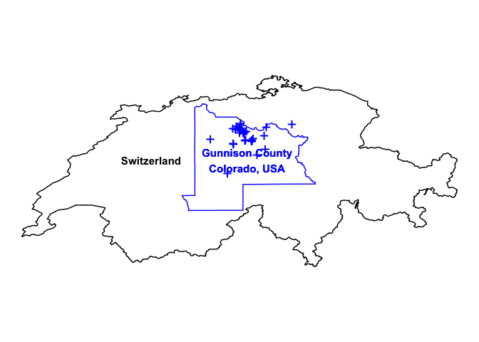
In reality my research didn’t cover the entirety of Gunnison County, so a more informative map would show the populations where I actually worked. So let’s do that (ht: journal requirements to archive raw data)…
# Read in data with focal population coordinates
pops<-read.csv("http://datadryad.org/bitstream/handle/10255/dryad.119000/SexRatios.csv")

overlay3 <- overlay2 +
  geom_point(data = pops, aes(x = longitude.dd, y = latitude.dd, group = NULL, fill = NULL),
             shape = "+", color = "blue", size = 6) +
  annotate("text", x = -106.955, y = 38.66481, label = "Gunnison County\nColorado, USA", size = 4,
           fontface = "bold", color = "blue")
overlay3
All that remains is to save the image in your desired file format. Dr. Woodroffe produced a nice effect by first showing a homerange polygon she made for a pack of African Wild Dogs that she’s been studying. The background was made transparent, so that the images of Wild Dogs in the background still shown through. Then she added the outline of Switzerland (also with a transparent background) to call emphasis to her point: a pack of Wild Dogs needs an area the size of several Swiss cantons to survive. Note that this is only possible with image formats that allow transparency (e.g. .png, .svg, .pdf).
2. How many Switzerlands is a California?
Admittedly this is an absurd question, though perhaps it could pass as merely whimsical if you the reader are feeling generous. However, it offers an opportunity to show off some other tricks elide has hidden up its sleeve. You see, elide doesn’t just move Spatial* objects to new latitudes and longitudes, it can do much, much more.
A quick look at ?elide tells all. In addition to the argument for shift that we used to move Switzerland over to central Colorado, there are arguments to reflect objects (sure to please West Wing fans), scale them to larger or smaller sizes while preserving shape, or rotate them around any point. Moreover, elide can work its magic on more than just vector files. With these tools you are the choreographer of continents, rewriting the rules of plate tectonics.
2.1. Gather spatial data
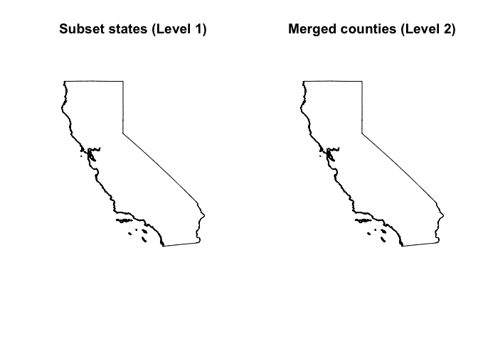
We’ve already have an outline of Switzerland from code in §1.1. Now we’ll retrieve data for California. There are two ways of doing this. The mirrors our approach to isolating Gunnison County, Colorado from Level 2 data; we simply download Level 1 boundaries for the USA and subset to the state of California. The second merges all of the counties of California from the Level 2 data (already downloaded and in our work environment).
## Approach (a): Download states, subset to California
USA.1 <- getData("GADM", country = "USA", level = 1)
# subset to focal county
CAfromstates <- USA.1 %>%
  subset(., USA.1$NAME_1 == "California")

## Approach (b): Merge counties to form California
CAfromcounties <- USA.2 %>%
  subset(., .$NAME_1 == "California") %>%
  unionSpatialPolygons(., .$ID_1) # ID_1 merges all polygons within California

opar <- par(mfrow=c(1,2))  # panel plots
plot(CAfromstates, main = "Subset states (Level 1)")
plot(CAfromcounties, main = "Merged counties (Level 2)")
2.2. Move Switzerlands to California: First approximation
We’ll start by crudely estimating how many Switzerlands will fit in California. We can do this any number of ways, but for a rough idea we can look at the bounding boxes of both California and Switzerland with bbox(). This will return the minima and maxima for both latitude (y) and longitude (x).
# Absoulte bounding boxes
bbox(CAfromstates)

##          min        max
## x -124.41556 -114.12949
## y   32.53088   42.00983

bbox(switz)

##         min      max
## x  5.956063 10.49511
## y 45.817059 47.80848

# Relative bounding boxes (column differences)
(CA.dimensions <- bbox(CAfromstates)[, 2] - bbox(CAfromstates)[, 1])

##         x         y
## 10.286072  9.478947

(switz.dimensions <- bbox(switz)[, 2] - bbox(switz)[, 1])

##        x        y
## 4.539049 1.991425
These measurements can be particularly misleading for longitude, because the distance between lines of longitude approaches 0 towards the poles. Switzerland, being located farther north, will thus have closer lines of longitude. Distances between latitude aren’t exactly equal because Earth is not a perfect sphere, but they’re more consistent. We’ll use latitude as the basis for a first guess of how many Switzerlands to use.
# Calculate a multiple describing how many Switzerland "heights" (=latitude range)
# are needed to equal the "height" of California
(mult <- CA.dimensions["y"]/switz.dimensions["y"])

##        y
## 4.759882

# Make five Switzerlands and move over to approximately line up with California
CA.center <- gCentroid(CAfromstates)
CA.longitude.center <- CA.center@coords[1]  # this will be the (shared) target longitude
CA.latitudes <- seq(bbox(CAfromstates)["y", ][1],  # these will be the target latitudes
                    bbox(CAfromstates)["y", ][2], length.out = ceiling(mult))
shifts <- cbind(CA.longitude.center-coordinates(switz.center)[, "x"],
                CA.latitudes-coordinates(switz.center)[, "y"])

switz.shifted.list <- vector(mode = "list") # create list to hold elided Switzerlands
for(i in 1:nrow(shifts)){  # automatically generate and store enough elided Switzerlands
  switz.shifted.list[[i]] <- elide(switz, shift = shifts[i, ])
}

# Visualize Switzerlands on California
plot(CAfromstates)
invisible(lapply(switz.shifted.list, function(x){plot(x, col = rgb(1, 0, 0, 0.8), border = "transparent", add = T)}))
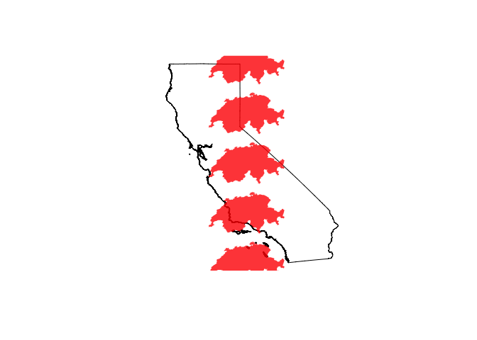
The result is a good first pass, but the alignment poorly matches the curved shape of California. Also, the northern-most and southern-most Switzerlands overlap borders of California. We could manually adjust all of these, but this would be a headache even with the small number of Switzerlands we’ve generated. Thankfully there’s a better way…
2.3. Move Switzerlands to California: A better approximation
The strategy here is to divide and conqueor. We’ll cut California into latitudinal regions, then use the gCentroid function from earlier to calculate a centroid for each region. Finally, we match a Switzerland to each region’s centroid.
## Make five regional polygons (i.e. make 4 slender "cuts" of the latitudinal extent of CAfromstates)
CAextent <- as(extent(CAfromstates), 'SpatialPolygons')
crs(CAextent) <- proj4string(CAfromstates)
regions <- data.frame(x = unname(bbox(CAfromstates)["x", ]),
                      y = rep(seq(bbox(CAfromstates)["y", "min"], bbox(CAfromstates)["y", "max"], length.out = 6)[2:5], each = 2),
                      id = rep(letters[1:4], each = 2)) %>%
  split(., f = .$id) %>%
  lapply(., function(x){Line(x[, c("x", "y")])}) %>%
  Lines(., ID = "breaks") %>%
  list(.) %>%
  SpatialLines(., proj4string = CRS(proj4string(CAfromstates))) %>%
  gBuffer(., width = 1e-8) %>%
  gDifference(CAextent, .) %>%
  disaggregate(.)

## Warning in gBuffer(., width = 1e-08): Spatial object is not projected; GEOS
## expects planar coordinates

# Calculate centroids of each region
region.centers <- gIntersection(CAfromstates, regions, byid = T) %>%
  gCentroid(., byid = T)

# Quick visualization that centroids were calculated correctly
plot(regions)
plot(CAfromstates, add = T)
plot(region.centers, add = T)

## Elide a Switzerland onto each centroid
shifts2 <- cbind(coordinates(region.centers)[, "x"]-coordinates(switz.center)[, "x"],
                coordinates(region.centers)[, "y"]-coordinates(switz.center)[, "y"])

switz.shifted.list2 <- vector(mode = "list") # create list to hold elided Switzerlands
for(i in 1:nrow(shifts2)){  # automatically elide Switzerlands to the centroids
  switz.shifted.list2[[i]] <- elide(switz, shift = shifts2[i, ])
}

# Quick visualization of the results
plot(CAfromstates)
invisible(lapply(switz.shifted.list2, function(x){plot(x, col = rgb(1, 0, 0, 0.8), border = "transparent", add = T)}))
points(region.centers, pch = "+", col = "white", cex = 6)
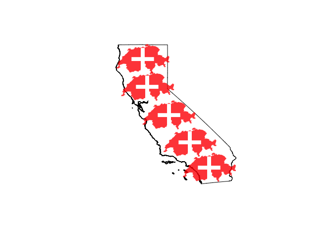
Here we can see that the fit is much better when using regional centers (white “+” symbols), especially as an automated approximation. Pardon the visual pun to the flag of Switzerland.
2.4. Beyond shifts
elide also allows Spatial* objects to be rotated, perhaps allowing us to get a better fit. Let’s focus on the southern-most Switzerland, manually rotating it to better fit over southern California. We’ll tell it to rotate 200 degrees clockwise around its centroid (IMPORTANT: the center of rotation refers to the object before any other transformations have been applied).
# Replace the 1st (southern-most) Switzerland, adding a rotation
switz.shifted.list2[[1]] <- elide(switz, shift = shifts2[1, ], rotate = 200, center = coordinates(switz.center))
plot(CAfromstates)
invisible(lapply(switz.shifted.list2, function(x){plot(x, col = rgb(1, 0, 0, 0.8), border = "transparent", add = T)}))
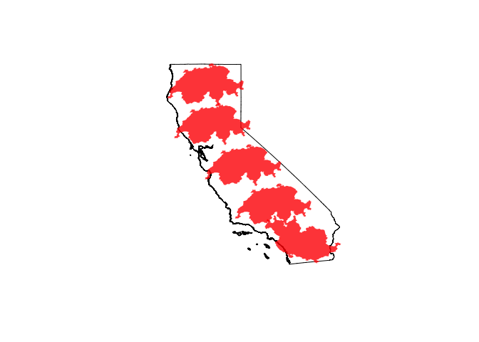
From here on in, the fit battle is a game of (manual) guess-and-check. Still, we’ve gotten close enough that any person who has lived in Switzerland can understand the scale of California visually and viscerally.
Upshot
There are 4-5 Switzerlands in a California, and visualization helps give audiences in both places a sense of scale in the other.
I’ve broken two big rules with this post. First, manually aligning the positions of Spatial* objects is generally a really, really bad idea. The rgdal package has excellent tools for spatial transformation that will do what you tell it to correctly and reproducibly. Uses of elide beyond producing figures should be approached with the upmost caution. Second, filling California with Swiss flag Switzerlands is wretched graphic design. Take it from Tufte who said:
Clutter and confusion are not attributes of data - they are
shortcomings of design.
But perhaps you foresaw some tongue-in-cheek from the post title. Now if only it were just as easy to elide a decent burrito over here to Switzerland…